Pages

Showing posts with label photoshop. Show all posts

Wednesday, 5 March 2014

Biomimicry in Watercolour

Using the loose technique of watercolour I had adopted earlier in the project, I used this to re-invent previous known products and inspirations of biomimicry. I decided to illustrate previous inventions of biomimicry in order to 'celebrate' the innovations we already know, or may not be aware of, so that the future of biomimicry can be supported and admired as a process of innovation.

Nature has inspired and keeps on inspiring innovations with a title of biomimicry, and I feel that it is important that everyone understands how important nature is as part of the future of innovation.

Here are some initial watercolours inspired by various inventions of biomimicry:


The Wright Brothers invented the plane in 1903 after studying the movement of birds, in particular turkey vultures. This phenomenon has enhanced transport centuries later, all studied from the movement of birds in nature.
The Wright Brothers invented the plane after being inspired by a turkey vulture.


The 'Flex-Foot' was invented by Van Phillips in 1984 after he lost his foot in an accident at just 21 years old. Today, the 'Flex-Foot' is used by 90% of Paralympian athletes therefore I have illustrated this innovation in watercolour as a 'celebration' of biomimicry.

Van Phillips invented the 'Flex-Foot' after being inspired by the hind legs of a cheetah.


The Eastgate Centre in Harare, Zimbabwe was designed by architect, Mick Pearce after being inspired by termite mounds which use a complex ventilation system, enabling natural air conditioning and heating of buildings without installing costly systems.

Mick Pearce inspired by termite mounds for his design of the Eastgate Centre, Zimbabwe.

After showing these illustrations at my formative assessment, the tutor, Christian Lloyd, suggesting that they could be a lot more abstract and less literal to become more effective as stand alone pieces. It was also suggested that I look at some more watercolour artists to gain inspiration and knowledge about current trends in watercolour illustration.


Photoshop Manipulation

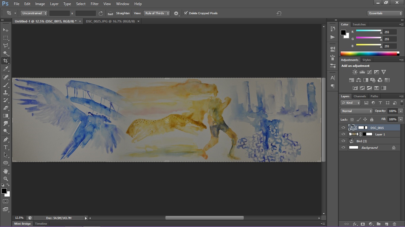
Putting the cheetah/ paralympian watercolour image in Photoshop allowed me to define the line and brighten the tones to make it stand out more. However, manipulating the image this much has made the watercolour lose its subtle edges and blending of tones.


Using Photoshop, I was able to create a larger image with a mixture of all 3 images. To create this, I used the layer mask tool so I could overlay a gradient over the layers to make them blend into each other. This could be used as a mural in the 3M Buckley Innovation Centre, printed on a large scale and placed on the wall as a mural sticker so the watercolour wouldn't lose its subtlety.


Thursday, 20 February 2014

Photography Edits in Photoshop

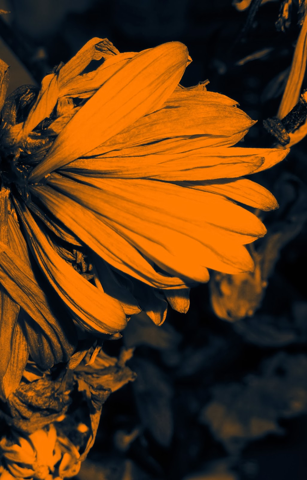
Using Photoshop, I manipulated my primary source photography to alter the tones which give different moods, almost changing the context of the natural form.


Whilst these Photographs above are of the same plant, they are captured and edited in unique, innovative ways. The image on the left presents a calm atmosphere with the orange tones, hinting at a morning sunrise. The image on the right is darker and appears more mysterious. The sharp white of the plant cuts through the darkness, creating a strong image.


The image above is more simplified with its black and white tones. The plant almost imitates a 'scribble' in the air. I love the natural delicacy in all of these images which the camera has captured. The different colours emphasise a variety of moods which the viewer can interpret.


On my venture to Castle Hill, I actually found and photographed some burr plants which were initially used by George de Mestral to inspire him to create velcro. It was intriguing to see them in person as when I photographed the oddly shaped plants and edited it in Photoshop, it gave a sense of futurism. Even the background gives a sense that they are on another planet.


These images are cropped versions of the original close up dead flower which was photographed indoors. The pink is natural and unedited whilst the blue tint on the left image gives a more subtle hint of tones and a greater sense of elegance and calm.


Simply rotating an image proves to be effective as this one imitates a flame, when in fact it is a leaf. Changing the colour to reflect its new shape instantly puts the natural leaf in an entirely new context.


The edit of the left highlights the line in the image, framing the individual petals. This was created using a gradient filter in Photoshop. The photo on the right is more natural looking, it almost appears at though a bright morning sunrise is shining down onto the petals, highlighting their beauty.

I believe that editing the photographs was a success, there a some new innovative approaches to standard photography which are unique and re-contextualise some of the nature. This kind of approach could be adapted to traditional media artwork inspired by this photography.


Wednesday, 5 February 2014

Leaf Relief Development

After creating my own leaf relief pieces, I scanned them onto my laptop and rendered them on Photoshop, experimenting with tone and line.


Just adding colour to the leaf relief pieces on Photoshop highlights the detail in the veins of the leaves, producing a more effective, stronger image. The blue tone creates an almost neon effect on top of the metallic texture of the foil underneath, whilst the green brings back a sense of the original natural colour. Manipulating the images digitally has greatly enhanced their quality and I believe makes them stronger as a general observation.

This method could be further developed to compliment leaf relief technique.

More to come!